Farewell Adidas: The Best/Worst Bearcats’ Adidas Football Uniforms

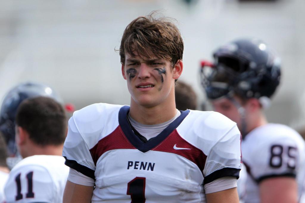
It’s been an interesting 8 year relationship between Adidas and Cincinnati. Adidas brought flash and what they believe to be “New-age” fashion to school that had previously worn only simple, clean designs. For Bearcat fans, a world of cat scratches, chain male, and stretch marks is a world that would rather be unseen. Rejoice! Under Armour is here.

Before trashing Adidas and their previous screw-ups, let’s take a look at what they’ve done right. Here are the top 5 Adidas uniforms worn by the Bearcats:

5. 2015 All-White vs Toledo – Simple and Clean. The stretch marks and chain male were almost invisible on the white uniforms. The Cats scratched a chrome logo concept on the white helmet for a nice all-black logo. This was done for the sake of visibility on TV but ended up looking much better, in general, compared to the potential chrome logo.

Screen Shot 2015-07-20 at 11.02.04 AMScreen Shot 2015-07-20 at 11.01.15 AM

4. 2008 Black on White vs Syracuse – For the first time since the switch to Adidas, UC wore black on white. Hopefully, this brings back great memories for Bearcat fans as the cats clinched their 1st Big East title that day.

Screen Shot 2015-07-20 at 10.51.29 AM Screen Shot 2015-07-20 at 10.51.12 AM

3. 2013 Black on Black with Chrome Decals vs Louisville – In the last game played at Nippert, the Bearcats broke out some special chrome helmet decals (as did Louisville). It was the only time all year that the silver numbers didn’t look ridiculous.

Screen Shot 2015-07-20 at 11.06.05 AM Screen Shot 2015-07-20 at 11.05.58 AM

2. 2009 White on Black vs Pitt – This pick had more to do with the game rather than the actual uniforms. Although, they were nothing special, their look will be engrained in my heart until the day I day along with the words “To the end zone it goes…. Caught!” These uniforms capped off the perfect season.

Screen Shot 2015-07-20 at 11.11.17 AM Screen Shot 2015-07-20 at 11.10.08 AM

1. 2014 All Black vs ECU, Houston – These uniforms were perfect (except for the claw scratches). This was easily Adidas’ best look for the Bearcats. The change back to white numbers was much needed. After a long season of mixing up the uniform combos, it was nice to see the modernized, classic look.

Screen Shot 2015-07-20 at 11.00.10 AM Screen Shot 2015-07-20 at 10.59.44 AM

See, that was fun. A little nostalgia never hurt… Not so fast! Time to remember why we’re so excited about leaving Adidas. Here are the worst 5 looks from Adidas:

5. 2012 Black on Red vs Virginia Tech – I appreciate the effort in the attempt to mix things up but, this just didn’t work for me.

Screen Shot 2015-07-20 at 11.08.48 AM Screen Shot 2015-07-20 at 11.08.21 AM

4. 2010 White on White vs Louisville – This was the game where Adidas debuted their new Tech-Fit jerseys and UC was the guinea pig. My biggest problem with these is that the jersey and pants do not match. Adidas had yet to “perfect” the Tech-Fit pants, so the Cats were mix-matched for most of the season. Not the best work by Adidas.

Screen Shot 2015-07-20 at 10.56.57 AM Screen Shot 2015-07-20 at 10.56.46 AM

3. 2008 The Black Jerseys That Almost Happened – When Adidas originally unveiled UC’s new uniforms in 2008, these were the black jerseys that were presented. Those red side panels looked terrible. It is a VERY good thing that those were removed. the all-black look is much cleaner.

Screen Shot 2015-07-20 at 10.49.42 AM Screen Shot 2015-07-20 at 10.49.20 AM

2. 2013 Black on White – As I mentioned before, the silver numbers in 2013 were not pretty. Typically a good combo, the 2013 version was terrible. The contrast between the silver numbers and white pants drove me insane. Throw in the pink accessories worn that day and it looks even worse.

Screen Shot 2015-07-20 at 11.03.54 AM Screen Shot 2015-07-20 at 11.03.29 AM

1. 2013 Black on Red with Red Helmets vs UNC – This is one of the worst combos I’ve ever seen. Uniforms are supposed to match and flow together well in some form or fashion. With this combo, there was no hope. The Red and Black on the helmets and pants didn’t work with the Black and Silver on the jerseys. SILVER IS NOT A TEAM COLOR (for good reason). Screen Shot 2015-07-20 at 10.55.32 AM Screen Shot 2015-07-20 at 10.55.22 AM

I would love it if i could erase some of these from my memories. Hopefully, Under Armour doesn’t try to pass off any train wrecks on the Bearcats. The new uniforms will be unveiled soon (August). It should be interesting to say the least. There is a lot of hype and the fans don’t want to be disappointed/embarrassed.

UPDATE: Cincinnati To Under Armour

Announced today that the Bearcats will be Under Armour as of June 31 of 2015. The details of the contract are yet to be announced but It is rumored to dwarf their previous Adidas contract. As mentioned previously, Cincinnati had been with Adidas since 2006 (2008 in football). They were Nike/Jordan before that.


UPDATE: Deal is rumored to be worth $4-5 million/year. Previous deal with Adidas was worth $1.5 million/year.

Adidas Loses 2 Premier Schools; Adds 2 More

Adidas shocked the college football world recently by announcing their addition of Miami (FL) as a member school. Miami has long had ties with Nike and was one of their first premier schools, revolutionizing the equipment landscape with “The U Swagger.” A new age is coming upon the Hurricanes as the cut the ties of their iconic relationship with Nike. So what does Adidas have to offer Miami? The specific details have not been released but it is speculated that the deal is worth $90 million over 12 years. Here is what Adidas has released thus far. I do not expect either of these to hit the field. The brand just had to put something out there to appease the fans.

Miami adidas cleats Miami Adidas

The cleats are a bit outrageous but I find the uniform to be too simple for Miami. Both are purely concepts at this point. This, however, I hope to never see again:

Screen Shot 2015-01-20 at 9.36.10 PM

Continue reading

Best/Worst Uniform Match-Ups: Week 10

I just want to start by swallowing my pride a little bit. I expected the Florida State/Louisville game to look TERRIBLE…. But I was wrong. Florida State altered their uniforms a bit to the point where they actually look good. Louisville wore special adidas uniforms that definitely looked better in action.

DSC9397 458137292 Florida State v Louisville

Continue reading

Fixing Florida State

Winning 23 straight games, Florida State has been the most successful team in college football over the past 2 years. With success comes scrutiny and they have received their share of scrutiny, deservedly so. FSU has had multiple scandals involving players, most notably Jameis Winston. But we’re not gonna get into that. This season, the Seminoles received new uniforms from Nike with collaboration from the local Seminole Tribe leaders. Recently, Native American mascots in sports have come under fire from the tribes. Florida State is one of the few teams that has gained approval of their tribe. The school and the tribal leaders got together and came up with a new logo and wordmarks along with new uniforms for each sport in order to preserve the likeness and tradition of the Seminole Tribe.

Continue reading

Best/Worst Uniform Match-Ups: Week 9

8. Yale vs Penn – Great Ivy League match-up. Yale’s uniforms are classic. The pants are a bit strange, but I can deal with it. Penn’s uniforms are unique. They have that weird Nike chest stripe. They wore their blue helmets with gray pants. I thought it was a good look 1 on 1. It’s nice to give the small schools some attention.

hc-yale-penn-1026-20141025 B0zx4PaIMAEk94d.jpg-large 42513_dsc_2447f

Continue reading

Death By Chrome

First, there was matte. Then, there was chrome. It’s becoming the hottest trend in college football. Mostly on helmets, chrome is a shiny, metallic finish. It can be a really good look for some teams, but most of the time, it looks pretty terrible. Adidas has even used chrome numbers and decals on jerseys  (looks terrible).

Schools in the MAC and Sun Belt feature much more chrome than the larger programs. Oregon wears chrome almost everyweek. Chrome is finding its way into the more tradional programs like Michigan State and USC. Both teams have worn chrome helmets recently.

Coach%20D%20Chrome%202%20Oct%2017-c ncaa-football-colorado-southern-california2-850x560

Continue reading

Wake Me Up When Pinktober Ends

1397323_248023742017793_974520822_oEvery year in October, breast cancer awareness month, teams break from their color schemes and wear pink. Whether they wear a little or a lot, it usually looks terrible. Now, I’m not hear to say that raising cancer awareness is bad. I’m all for it. I just hate seeing teams ruin their look by adding pink. Most traditional schools stray from it, but teams like Oregon are not shy to mix it up.

Continue reading

Best/Worst Uniform Match-Ups: Week 8

8. Utah vs Oregon State –  Utah went full stormtrooper. Their all-white look is great. I’m a big fan of the red, white and black color scheme. Oregon State wore semi-chrome orange helmets with orange jerseys and black pants. The numbers on the helmets sold me on this combo. Great job by both teams. Utah went on to win in 2OT.

10441884 WFSBBDXWVQZTEHJ.20141017061624 Utah v Oregon State

Continue reading

Can You Smell What The Rock Is Cooking?

Division II football program, Slippery Rock University, is one of the more unique programs in all of college football. Known as “The Rock”, the football program was founded in 1898. The inaugural team finished with a 1-0 record beating New Castle HIGH SCHOOL. The Rock has come a long way since then and has quite the tradition for a Division II program: 9 conference championships, 527 wins, and 7 playoff appearances. The team’s current uniforms are very traditional and are some of the best in college football. The uniform features a complimentary striped base layer to give the feel of an old style long sleeve football jersey. Their color scheme, green and white, and their logo, a block S, are extremely simple.

Capture

Continue reading